Not a bad logo. BTW Super Mario 3 was one of my favorite video games growing up.
Pogo
It's a new morning in America... fresh, vital. The old cynicism is gone. We have faith in our leaders. We're optimistic as to what becomes of it all. It really boils down to our ability to accept. We don't need pessimism. There are no limits.
Gipp got them yellows, got them purples, got them reds. Lights gon' hit and make you woozy in your head. You can catch me in my 2 short drop. Mouth got colors like a Fruit Loop box! It's what it do, in the Lou'. Ice grill, country grammar. Where the hustlers move bricks and the gangsters bang hammers. Where I got 'em you can spot 'em on the top on the bottom. Got a bill in my mouth like I'm Hillary Rodham.
Nice to see other esteemed gentlemen on the board got decent taste in music and surprisingly, a fondness for "that rap crap."
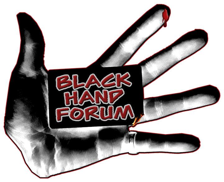
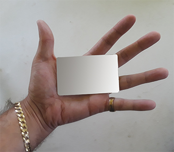
In all seriousness though: I could use a critique. Looking back over this, if we use it:
1 the entire right side of the card should be burning, as it is right now it's barely noticeable.
2 the hand needs to be more "cartoonish" and not like it is now, large it doesn't matter but it made into an avatar or page logo it won't look right.
3 B.'s a good artist/drawer/painter, I've seen his work and think he may be better at logos than I am. So I'm curious to get his input and what he thinks.
Chris Christie wrote: ↑Wed Aug 01, 2018 7:05 pm
3 B.'s a good artist/drawer/painter, I've seen his work and think he may be better at logos than I am. So I'm curious to get his input and what he thinks.
Great design that incorporates some cool details...! Didn't realize it was a card at first so more burning might be cool though I like the subtlety. Maybe a more old timey font since it's a card also?